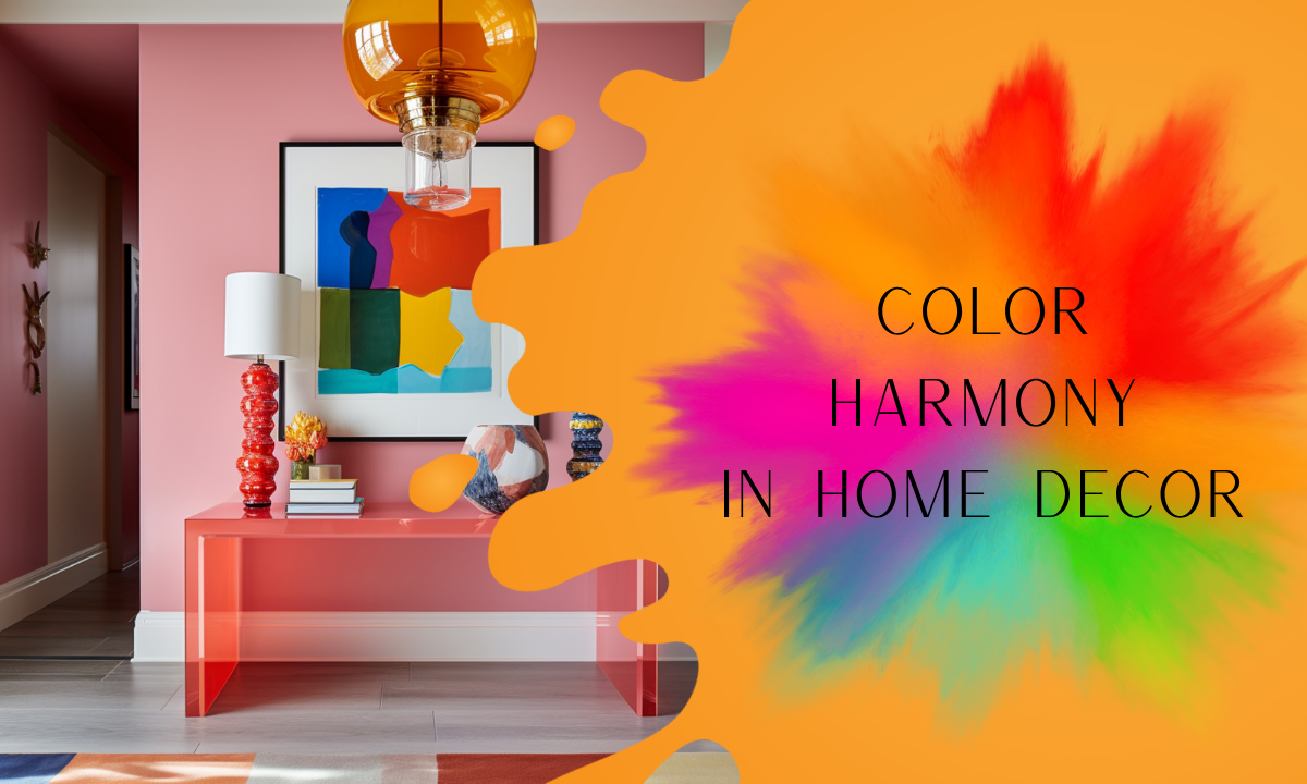
How to Achieve Color Harmony in Home Decor? The Role of Rugs
Color harmony is one of the most important elements that define the energy and aesthetic balance of a living space. With the right color combinations, even the simplest room can be completely transformed. So how can we create this balance in interior design? The answer lies in two key tools: the color wheel and the right rug choice. Especially printed rugs that cover large areas play a major role in setting the tone of a room. In this article, we explore how to achieve color harmony in your home and how rugs contribute to this aesthetic.
What Is the Color Wheel and Why Is It Important?
The color wheel is a visual tool that shows the relationships between colors. With its help, you can easily identify:
-
Complementary colors (opposite but harmonious),
-
Analogous colors (from the same color family),
-
Triadic combinations for dynamic balance.
Example:
If your room is dominated by light blue tones, a rug with warm orange accents (its complementary color) can instantly add warmth and vibrancy.
Color Combinations & Rug Selection Tips
Rugs are central elements in spaces like living rooms, bedrooms, and hallways. Here are a few color harmony and rug pairing suggestions:
Monochromatic Harmony
Using different shades of a single color.
→ Example: Grey sofas, light grey walls, and a deep charcoal-toned rug.
Complementary Color Harmony
Combining opposite colors for a striking effect.
→ Example: Green plants, beige furniture, and a rug with orange accents.
Analogous Color Harmony
Pairing closely related colors for a soft and cohesive look.
→ Example: Yellow, mustard, and orange in a room + a warm beige-yellow patterned rug.
How to Ensure Color Harmony When Choosing a Rug
-
Analyze your furniture and wall colors. The rug acts as a bridge between them.
-
In colorful rooms, go for a simple rug. Too many patterns can feel chaotic.
-
In minimalist spaces, bold patterned rugs can be the centerpiece. A big plus for printed rugs!
-
Use the color wheel as a guide. For contrast, choose opposite colors; for calmness, go with similar tones.
Rugendary Rug Pairing Suggestions for Perfect Harmony
✅ For Natural and Cozy Interiors:
In a space decorated with soft tones like cream, beige, and light brown, a rug with subtle patterns and warm undertones creates a welcoming atmosphere. Boho-inspired prints work especially well with wooden and rattan textures.
✅ For Modern and Sleek Spaces:
In rooms dominated by grey, charcoal, or black tones, a simple yet textured rug helps soften the sharp edges of modern furniture. Minimalist prints enhance the elegance without overpowering the room.
✅ For Vintage or Classic Decor:
In areas featuring antique furniture, rustic wood finishes, and velvet fabrics, a rug with soft vintage-inspired patterns adds character and charm. Pastel hues and classic motifs help complete the nostalgic look.
Conclusion: Color Harmony is an Art, and Rugs Are the Canvas
Achieving color harmony in interior design doesn’t happen overnight. But with the right tools—like the color wheel and a thoughtfully selected rug—you can dramatically transform your space. At Rugendary, we believe in the power of colors and patterns, offering inspiring rug designs for every space and every style.